Visualising Biological Data. GigaScience at VIZBI
The 10th anniversary of the EMBO Workshop: Visualising Biological Data (VIZBI 2019) took place in EMBL in Heidelberg last week. GigaScience Data Scientist Chris Armit was there and was astonished at the cinematic quality of the visualisations that were showcased over this 3-day meeting. VIZBI aims to improve the global standard of data visualisation in the life sciences, and this is of immense interest to GigaScience who archive large-volume image datasets and who wish to deliver webtools that allow researchers to interactively explore image data prior to data download. We’ve already been publishing immersive 3D visualisation tools (see iCave), and are embedding imaging visualisation tools for interaction with 3D models, so VIZBI is a great place to view and see showcased the state of the art in visualising biological data. Following his previous write-up in GigaBlog of the ESRIC Super-Resolution Clinic, here are Chris’s thoughts and experiences from the meeting.

Photo of the VIZBI AR Exhibit at EMBL by Christian Stolte
Grammar of Graphics revisited
On Day 1, the awesome Hadley Wickham of RStudio, co-author of “R for Data Science”, delivered his keynote talk on “Data visualization and data science” and explained how open source art packages, such as ggplot2, can be used to visualise multi-dimensional data. ggplot and ggplot2 are based on “Grammar of Graphics”, which was a highly influential book by Leland Wilkinson, and this included a core philosophy on how researchers should approach complex multi-dimensional data. With invaluable insight, Hadley showcased how ggplot2 and other R packages in the tidyverse collection can be used to deliver incredibly elegant visualisations.
From helices to pseudoknots: Visualisation of DNA and RNA
Hadley’s keynote talk was followed by an exploration of the visualisation tools researchers use to understand DNA and RNA. It was a great privilege to hear Susan Clark, Head of the Epigenetics Laboratory at the Garvan Institute of Medical Research, explain how their lab uses heatmap visualisations to explore encroachment of methylation on CpG islands. CpG islands are strings of cytosine and guanine that are enriched in the promoters of genes and that are usually unmethylated. However, Susan showed that in some types of cancer, both 5’ and 3’ encroachment of methylation is observed and this may represent one mechanism by which gene expression is dysregulated in cancer.
For the software scientist, there were some great tips from ENSEMBL’s Andy Yates, based at the EBI, who cuts the phrase “test on Titin” which means that he likes to test all visualisations on Titin (TTN) which is the largest gene in the human genome. This is sage advice for the genome visualisation community – if your visualisation works on Titin then it should work on all other genes. ENSEMBL are set to launch a new version of the human genome browser and Andy announced the pre-alpha release at this year’s VIZBI.
Philippe Collas of the University of Oslo offered some tantalising glimpses of the 3D epigenetic landscape, and this could revolutionise how we think about chromatin. Philippe showcased powerful examples of how 3D genome architecture can be used to develop a rich 3D coordinate framework, and furthermore highlighted how this could impact on our understanding of health and disease by highlighting aberrant 3D positioning of key genes in patients with the condition familial partial lipodystrophy.
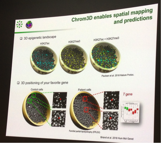
Philippe Collas with a nice example of visualising biological data, exploring 3D genome architecture.
In addition, there were diverse means of visualising RNA structure, with Irmtraud Meyer of the Max Delbrück Center for Molecular Medicine offering the arc-plot as a sophisticated means of allowing researchers to compare predicted RNA pseudoknot structure from ground-truth data. R-chie was Irmtraud’s webserver and R package of choice for visualising RNA secondary structure. I was mesmerised, and a little bit bewildered, by the cautionary tales of GigaScience Editorial Board member, Wolfgang Huber of EMBL-Heidelberg who has identified a tendency in the single-cell transcriptomic atlas community to make inappropriate assumptions about their data after dimension reduction. Very briefly, dimension reduction is a means of condensing large datasets so various trends can be more easily identified, with principal component analysis (PCA) as the most popular method of dimensionality reduction that is routinely applied to single-cell transcriptomic datasets. This is a perfectly legitimate way of enabling different transcriptional profiles, which may for example relate to different cell types, being used to structure an analysis. However, Wolfgang highlights that “high dimensional geometry is weird” and that it is inappropriate to assume that a cluster B positioned between cluster A and cluster C is actually an intermediate between these two clusters. This has ramifications for how researchers interpret these plots. Wolfgang’s take-home message is that dimension reduction “can create one-dimensional (“time-like”) patterns that have little to do with the data-generating process” and invites authors to be aware of over-interpreting linear relationships between these points.
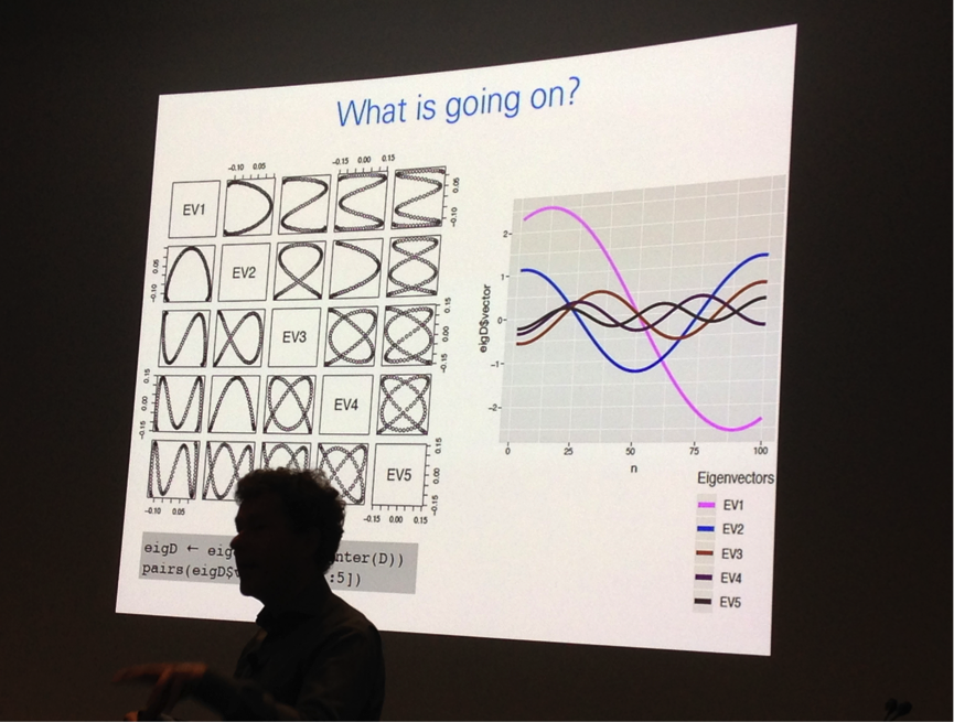
Wolfgang Huber uses graphical display of Eigenvectors to explain the complexity of dimension reduction.
Visualising proteins and macromolecular structure
The focus on Day 2, was primarily on proteins and cellular systems. There was a dizzying array of options for visualising protein structure, each suited to different users. David Sehnal of Masaryk University, Brno, Czech Republic presented Molstar, which is a sophisticated web-based visualisation tool for exploring macromolecular structure data available from PDB and other institutions. VIZBI co-organiser Sean O’Donoghue of the Garvan Institute of Medical Research offered live demos of the incredible Aquaria, which has the mission of “simplifying the generation of insight from protein structures”. For any protein sequence, Aquaria will show all related structures. Furthermore, the web interface has beautiful interactivity and Sean showcased how an amino acid sequence can be mapped onto the 3D structure. Lucy Collinson of The Francis Crick Institute highlighted the challenge of segmenting electron microscopy (EM) image data. Laborious manual segmentation is still very much the gold-standard procedure for delineating structures in EM images, although there is hope that machine learning using convolutional neural networks could offer an automated solution for segmenting these data. It was great to see another GigaScience Editorial Board member, Henning Hermjakob of the EBI, presenting the Reactome icon library which includes over 1250 unique icons that his groups use to generate enhanced high-level diagrams. Henning explained that the Reactome is a resource that allows users to find reactions, proteins, and pathways, and delivers these in a “textbook style”, with an emphasis on consensus view.
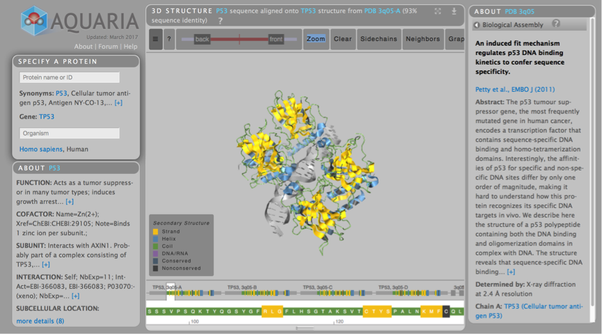
Aquaria is an incredibly powerful interactive protein visualisation tool, and live demonstrations on how to use it were provided by VIZBI co-organiser Sean O’Donoghue.
Science in a sandbox
On Day 2, the evening Keynote speaker was the amazing Janet Iwasa of the University of Utah, who uses animation “as a sandbox” to explore concepts and ideas that we introduce into our scientific models.
Janet’s animations are exceptional, and she was quick to point out that children, on seeing one of her movies about active transport in the cell, began to ask intelligent questions about exocytosis. Janet’s mission is “making scientists understandable” and believes that if we do not communicate our scientific models to a wider community, then we are “doing ourselves a disservice”. It further came across in her talk that Janet has a deep philosophical understanding of how animation can be used to communicate science. From a visualisation perspective, one of her most thoughtful considerations was her views on rendering: namely that if 3D and shaded, there is a feeling that much of this is known; if 2D and simple, there is a feeling that not so much is known. I took from this that an appropriate rendering choice can offer a subtle yet powerful means of increasing the public understanding of science.
I was moved by Janet’s movie on the Science of HIV (see embedded above). In addition to using easily understood analogies, for example referring to the “protease as molecular scissors”, Janet also made use of soundscapes, with different cello scores to represent external shots of HIV particles infecting the T cell, and internal shots of viral particles within the cell membrane, and within the cytoplasm. This a powerful and emotive means of communicating science, and testament to this is the following comment from the public that Janet showcased during her talk:
“…I tried watching your maturation video on scienceofhiv.org; as someone who is HIV-positive, I had to stop. The video is so simple, but it’s so powerfully graphic. I never thought that this is what must be going on inside me. I was awestruck.”
Janet is now working with the Allen Institute for Cell Science to develop a ‘Molecular flipbook toolkit’ that can import PDB files and allow researchers to animate proteins.
The Art and Science of Data Visualization
On Day 3, the focus was on Tissues and Organisms, and Populations and Ecosystems. Moritz Stefaner of Truth & Beauty, Lilienthal, Germany delivered his keynote talk on the art and science of data visualization, and explored the concept of the memorability of visualisation. This was a highly insightful concept, and Moritz invited the audience to think about what aspects of their talk, and indeed their visualisations are likely to be remembered. Using this underlying concept, Moritz explained how he took an example of complex data – it was originally a very busy network view of interactions between bees and flowers – and used these data to deliver communicative graphics focused around what could be considered the ‘lifestyle choices’ of different species of bee. As Moritz explained, this is a far more memorable visualisation than a network, which although important for analysis, does not easily convey a story. Another highly memorable visualisation was his slide showing an upside-down map of the world, which is of course perfectly valid, and highlights a visualisation convention that many of us ascribe to without any critical thinking.
Lena Maier-Hein of The German Cancer Research Center highlighted the need for visualisation in clinical and forensic use case settings. In forensic medicine, there is a need to integrate image data detailing internal and external wounds in the same coordinate space. In the example given by Lena, external photos or photogrammetry are used to create a 3D surface reconstruction of the external wound, and CT is used to deliver a volume reconstruction of the internal wound. Lena further explained that cinematic rendering of the integrated 3D reconstruction is an invaluable visualisation that can now be used in a courtroom setting. In the field of neurophysiology, Scott Waddell of the University of Oxford showcased beautiful renderings of Drosophila neurons to allow the audience to explore what he refers to as “6 metres of cable in a tiny fruitfly brain”. On the subject of alignments and phylogenies, VIZBI co-organiser Jim Proctor of the University of Dundee highlighted the benefits of computational tools such as Jalview in delivering gene-centric analysis, and Mauve in enabling a parallel coordinates display for comparative genomics.
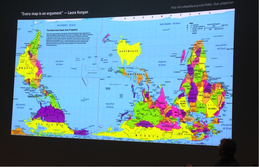
Moritz Stefaner showcased a Dyer projection upside-down map of the world. Does it invite us to think about the world differently?
Augmented Reality – the VIZBI perspective
 For the first time, an Art & Biology Augmented Reality (AR) exhibit was presented at VIZBI. We participated in this and the poster can be downloaded from figshare. Christian Stolte of The New York Genome Center, was the chair for the Art & Biology session and encouraged participants to use an app called Artivive that “lets you connect animations with art that hangs on a wall”. We’ve seen a similar approach used for conference posters (see GigaBlog on ECCB) but this is the first time we’ve seen it used for a conference session. Christian came across this app at an animation festival in New York and explained, “once the app’s image recognition algorithm detects your artwork, it inserts and plays a video you uploaded in place of your picture.” The Art & Biology AR exhibit was an exceptional use of the EMBL exhibition space, and I caught up with Christian at the Mobile AR in a Scientific Context breakout session to explore how this could be used in the context of a Big Data journal such as GigaScience.
The participants had a brainstorming session on how the Artivive app be used in a scientific context, and one of the most enticing ideas we came up with was the postcard-size poster. The core concept here is that one or more postcards could be used in place of a poster, with each individual postcard being able to trigger animated content or time-lapse movies that could be used to support an AR-based presentation. This concept has the added value of delivering a poster in your pocket, and is something I hope to see tried out at future VIZBI events. It occurred to me that it could equally be applied to printed publications, and a figure of time-lapse video-microscopy or cell tracking in a manuscript could be used to trigger a movie that can be watched using the Artivive app on your phone.
On Day 3, VIZBI presented prizes for Best Poster and Best Art & Biology image, and these were selected by popular vote from VIZBI 2019 delegates with the winners announced during the closing session on 15th March. The audience were delighted to see the extraordinarily gifted Beata Edyta Mierzwa of the Ludwig Institute for Cancer Research and University of California San Diego win both awards.

The Art & Biology prize at VIZBI 2019 was awarded to “Chromosome Segregation” by Beata Edyta Mierzwa. An artistic rendering of how chromosomes are segregated into two daughter cells during cell division – a fascinating process essential for all life. Image courtesy of Beata Edyta Mierzwa, www.BeataScienceArt.com.
This was an exceptional conference that brought together biologists, data scientists, and medical illustrators to name but a few. The palpable energy of VIZBI founders Sean O’Donoghue and Jim Proctor was contagious, and they are to be congratulated for organising such an outstanding and thought-provoking event. At the close of the conference it was announced that the 11th Visualising Biological Data meeting (VIZBI 2020) will be in San Francisco. I look forward to seeing you all there.