GigaScience at VIZBI 2021
The dizzying complexity of biological systems necessitates an abundance of tools that allow researchers to understand the deluge of sequence, structural, and systems-level data that is being generated in cell, molecular, and developmental biology. VIZBI (Visualising Biological Data) is a unique conference that straddles the disciplines of Life Sciences, Computational Biology, and Design in an effort to showcase the most cutting-edge approaches in visualising data in the BioSciences. Due to the COVID-19 pandemic, VIZBI 2021 was an EMBL virtual conference that took place from March 24th-26th, but with the ever-energetic enthusiasm of VIZBI founders Jim Proctor (University of Dundee) and Seán O’Donoghue (CSIRO & Garvan Institute) and VIZBI organiser Bjorn Sommer (Royal College of Art, London) this conference was as ever a visual treat. We are huge fans of this conference and GigaScience Data Scientist Chris Armit a regular attendee (see blog of VIZBI 2019). Following his other conference write-ups in this blog he details below what were some of the major highlights.
Fantastic Voyage: Journey to the Centre of the Cell
Virtual Reality (VR) enthusiast Rob Parton (Institute for Molecular BioScience, University of Queensland) presented the incredible “Journey to the Centre of the Cell”, a detailed and absorbing cinematic animation that that uses ‘real’ cellular data derived from 3D electron microscopy of a breast cancer cell (MDA-MB231) embedded in a 3D matrix (Movie 1). Rob uses this animation in an immersive VR context to communicate cellular anatomy and processes to classes of school pupils, and believes that this immersive experience enhances the learning process. Working with John McGhee (3D Visualisation Aesthetics Lab, UNSW Art and Design) and Angus Johnston (Monash, MIPS), this project uses a gaming methodology to allow users to move around and inside the cell, explore organelles and interact with endosomes and nanoparticles. In building the set, additional features were added to the ‘real’ cellular data, including animations based on real data, nanoparticles and colour. This astonishing work represents a milestone in digital learning in the context of cell biology.
Rob also offered a sneak preview of Nanoscape, which is a data-driven 3D model of the cell with real protein structures and protein and organelle dynamics based on real data. This is a highly significant quantitative cell biology approach that draws on the expertise of a team of 3D computer artists, computer graphics developers, and cell biologists. The preprint of Nanoscape is available on bioRxiv where the movies are also available for download.
Movie 1 – Journey to the Centre of the Cell takes users on a journey to the microscopic world of a cancer cell.
A Visual Grammar for 3D Genomics
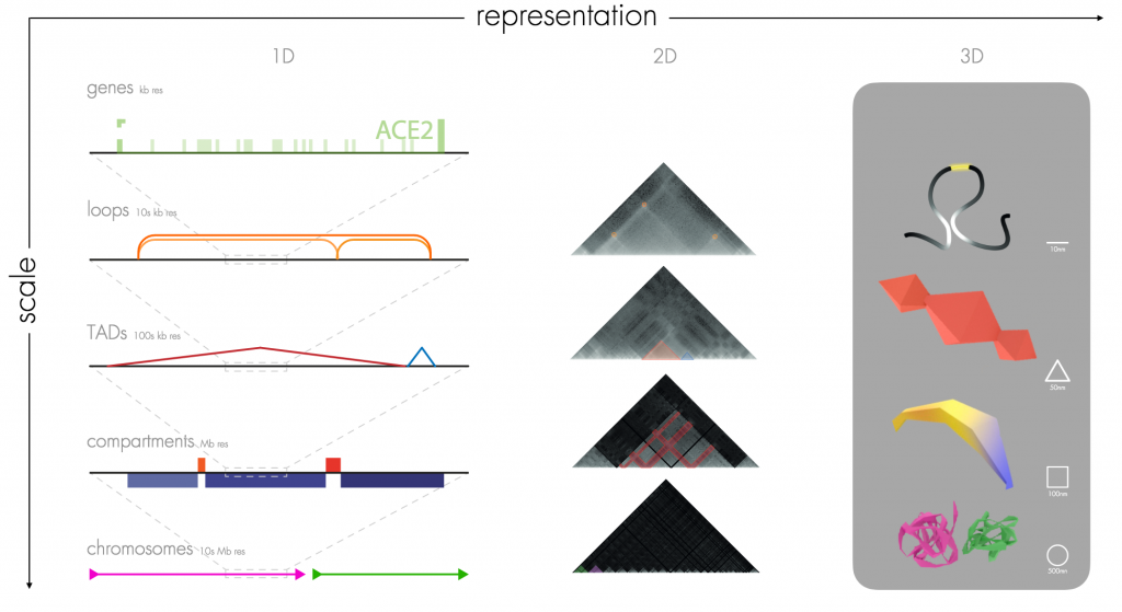
Resolution is a very important phenomenon in our understanding of the genome, and by exploring the features that appear at different scales Marc Marti-Renom (Centro Nacional de Análisis Genómico, Barcelona) highlighted the need for computer-generated geometric diagrams of genomes. As Marc explained, we can consider genomics data on the chromosome-level, which is on the order of tens of megabases (10 Mb resolution). However, as we zoom in on a chromosomal locus, we will next encounter compartments (Mb resolution), then topologically-associated domains (TADs) (100 kb resolution), then chromatin loops (10 kb resolution) and finally genes (kb resolution). This multi-scale visualisation problem is a known issue, and there is a salient need to express the resolution detail visually so that researchers intuitively know which resolution level of the genome they are looking at.
Towards this end Marc has teamed up with a design team at ELISAVA – Barcelona School of Design and Engineering (Carla Molins, Santiago Bonet, Yolanda Justicia and Clementina Altube) to generate a simplified 3D grammar for multi-scale features observed in 3D genomic experimental data. There is a beautiful minimality in what Marc is proposing – loops are presented as lines, TADs as pyramids, compartments as extruded quadrilaterals, and chromosomes approximates to spheres (Figure 1). This provides the much-needed visual framework to allow researchers to know the detail of resolution that they encounter. Furthermore, Marc presented a highly impressive movie that showcased the relatively smooth transition from chromosome-level through to loop-level graphical representations (Movie 2).

Figure 1 – Marc Marti-Renom presented his graphical representation of the genome. Genes (kb resolution), Loops (10s kb resolution), TADs (100s kb resolution), Compartments (Mb resolution), Chromosomes (10s Mb resolution). Image reproduced from his VIZBI 2021 slides here.
This visualisation tool may be something of a game-changer for genome browsers. In this respect, it is noteworthy that Marc would encourage for this grammar to be embedded within the context of existing genome browsers, such as HiGlass, Juicebox, and the 3D Genome Browser. These supplementary graphical views of the genome will certainly help researchers to orient themselves when zooming in and out of multi-scale genome data (see recent GigaBlog on the curious relationship of enhancers and TADs). I was additionally impressed to hear that a further advantage of this graphical visualisation strategy is that it can be applied to the 4D genome. As Marc further explained, the temporal challenge is essentially solved as these graphical visualisations can additionally be used to visualise, for example, TADS becoming larger or smaller over time in 4D genomic datasets. I look forward to these graphical 3D views being incorporated into existing genome browsers.
Movie 2 – Marc Marti-Renom showcased the transition from chromosome-level through to loop-level graphical representations. Movie kindly provided by Marc Marti-Renom.
Exploring Shape Stability of Protein Tunnels
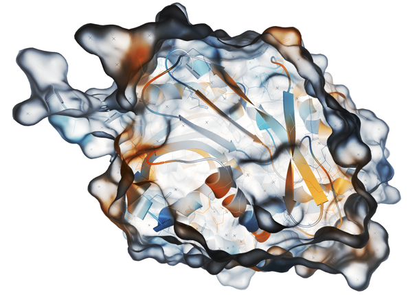
In the session on ‘Proteins’, I was very impressed by the presentation from Barbora Kozlíková (Masaryk University, Brno, Czech Republic) on protein tunnels. These are void paths connecting the protein surface with its active site, and they are known to be important in protein engineering and drug design. From a molecular dynamics perspective, it is known that there is physical motion of atoms in protein structures, and one of Barbora’s interests is shape stability of protein tunnels over time. To accomplish this, Barbora utilises the software tool CAVER to assist in the analysis and visualisation of tunnels and channels in protein structures (Figure 2). By exploring tunnel properties across and along the centreline over time, it is possible to identify bottlenecks that are relatively stable despite the jiggling of atoms. These regions of interest in the protein tunnel can be further explored via mapping of amino acids associated with the tunnel and one can investigate the correlation between, for example, hydrophobicity and charge of these neighbouring amino acids and tunnel morphology.
The CAVER visualisation tool is immensely useful and invites research questions such as ‘how do specific amino acids influence the tunnel?’ and ‘can this knowledge be useful in drug discovery or even our understanding of human disease?’. As Barbara explains, “visualisation can substantially aid the exploration process.”

Figure 2 – Barbora Kozlíková presented the software tool CAVER, which provides rapid, accurate and fully automated calculation of tunnels and channels in static and dynamic structures. Image reproduced from http://caver.cz/
Visualising Genome Assemblies
Chromosome-level genome assemblies are a major topic of interest for us at GigaScience and I was intrigued to hear Kerstin Howe of the Darwin Tree of Life Project & Wellcome Sanger Institute detail their strategy for high-throughput curation of genome assembly data. The Darwin Tree of Life Project is one of several initiatives across the globe working towards the ultimate goal of sequencing all complex life on Earth, in a venture known as the Earth BioGenome Project (see recent GigaBlog on updates from sequencing the tree of life). Curation is necessary to validate the multitude of draft genome assemblies and, as Kerstin explains, the intention here is to “remove artefacts and contaminants, reconcile produced assembly with raw data, ensure structural integrity, and identify chromosomes.”
Kerstin and colleagues created the genome evaluation browser gEVAL to visualise and assess discordances between an assembly and multiple sets of accompanying data. gEVAL was designed to allow quick navigation and identification of errors through its specific colouring of data in tracks and lists. An additional focus highlighted in the talk was the use of loop-resolution chromosome conformation capture methods – such as Hi-C – to assign scaffolds to chromosomes. The core concept here is that a locus on a chromosome is more likely to crosslink to an additional locus on the same chromosome, and this high ratio of cis-interactions relative to trans-interactions enables the assignment of scaffolds to their corresponding chromosomal units. Curation of an initial assembly may typically involve using Hi-C contact maps to make breaks and joins, and to remove stretches of erroneously duplicated sequence (Figure 3). However, as Kerstin explains, “coverage noticeably dips in centromeric regions” and this can lead to inaccuracies as the centromeric region may appear inverted in Hi-C assemblies. The overall curation approach has recently been published in GigaScience, where it is noted that “chromosome-wide patterns of repeat proportion and GC content can also be used to affirm completeness of chromosomal units”.
Figure 3 – Hi-C maps showing the Asterias rubens (starfish) genome assembly (sequenced as part of the Sanger Institute’s 25 Genomes for 25 Years project) before (A) and after (B) curation. Hi-C maps were generated using PretextView. Image reproduced from the GigaScience publication.
Kerstin further lists a comprehensive series of metrics – counts of scaffolds and contigs, N50 measures of contiguity, BUSCO scores of genomic completeness, variant calls to assay overall heterozygousity – that are provided for each and every genome. These metrics are used to highlight the importance of this curation effort, for example by detailing the changes in scaffold N50 contiguity.
Quantifying Embryogenesis
One of the major functions of genes is to transform the fertilized egg into the multicellular lifeforms that we see around us. In many ways, this is the most difficult aspect of biology for us to understand. Léo Guignard (Turing Center for Living Systems, Marseille) embraces this perplexing topic and explored means of quantifying similarities and differences that exist between developing organisms. Using the marine tunicate Phallusia mammillata as a model organism, Léo showed that it is possible to develop a lineage map of where cells begin and where they end up in what looks like a relatively stereotypical process.
What about mammalian development? Placental mammals develop within the uterus of the mother to a relatively advanced stage of development, and this means that direct visualisation of embryonic development is not straightforward. However, it is possible to culture early stage mouse embryos ex utero, and this allows Léo and colleagues to visualise development from a single layer of cells – known as the blastula – through its differentiation into a complex multi-layered embryo – a process known as gastrulation – after which organ development begins. The stunning movies of in toto mouse development were generated using light-sheet microscopy at HHMI Janelia by Kate McDole and Philipp Keller, and through live imaging analysis of multiple embryo samples Léo and colleagues were able to follow the flow of embryonic cells through development to obtain a statistical fate map that measures the probability of a cell – such as a precursor mesodermal cell – being identified in a specific location such as the heart field at a later stage of development (Movie 3). I was mesmerised by these visualisations, and I did ask Léo if the beating cardiogenic cells of the developing heart caused any issues for tracking cells in the mouse embryo. Léo explained that this is an issue and that the large-scale movements created by the beating of the heart from mid-gestation are a limitation to long-term statistical tracking.
Movie 3 – Léo Guignard used single cell statistical tracking to monitor cell flow in ex utero mouse development
Visualising Disease Trajectories
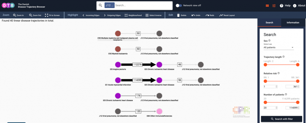
Disease trajectories can be a difficult concept to convey visually as there is inherent complexity in human disease with co-morbidity / multi-morbidity being the term used to describe more than one disorder in a single individual. To address this challenge, Jessica Xin Hjaltelin (Copenhagen University) has the insightful approach of using Sankey diagrams to highlight trajectories between disease conditions. Sankey diagrams are a visualisation method used to display flows, and in the context of disease they highlight the flow from one disease state to another. This visualisation approach has been incorporated into the Danish Disease Trajectory Browser, which is a web-based tool that enables exploration of temporal, population-wide multi-morbidity in a staggering 7.2 million Danish patients from the Danish National Patient Registry (Figure 3). Last year we published a similar clinical trajectory analysis tool validated with the same dataset called ClinTrajan, and this new approach takes this much further. The very intuitive interface provides additional detail, such as the number of patients that progress from angina pectoris to chronic ischaemic heart disease, and I see great benefit of this type of visualisation for the public understanding of science and medicine. As Jessica explains, the next step is to explore these disease networks further, with the possibility of using machine learning algorithms to predict disease trajectories in the Danish population.

Figure 3 – Jessica Xin Hjaltelin presented the Danish Disease Trajectory Browser, which uses Sankey diagrams to explore population health and disease. Image reproduced from DTB website.
In the closing session, VIZBI presented prizes for Best Poster and Best Art & Biology image, which were selected by popular vote from VIZBI 2021 delegates. The extraordinary artwork of David Goodsell (Scripps Research) and colleagues won the Best Poster award for “Building a whole cell in 3D”. Karolína Kryštofová (Masaryk University, Brno, Czech Republic) won the award for Best Art & Biology image with “Hallmarks of Cancer”.